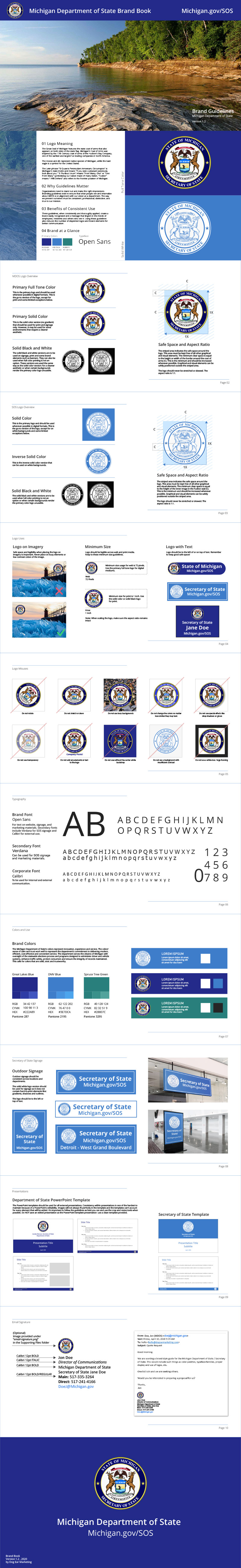
The Michigan Department of State (MDOS) / Secretary of State reached out seeking a proposal for a brand style guide that would include such things as color palettes, typeface families, proper display and use of logos, etc. You can imagine over the years there were many MDOS logo versions and colors floating around and the Director of Communications wanted to get a handle on using the brand consistently for Michigan residents.
A Single, Revised Logo
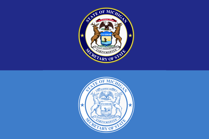
Like many businesses, MDOS and SOS had many, many versions of their logos in use across a variety of media. They sent several examples of these logos as inspiration for a new, refreshed design that incorporated the necessary elements while also remaining 'stately'. One requirement was to have a similar look to the Attorney General's Seal.
Brand Booklet
The brand book ensures that what people see and internalize about MDOS is in alignment with their vision as a department. The way they present ourselves must be consistent, professional, distinctive, and true to their mission.
The guidelines, when consistently and thoroughly applied, create a brand easily recognized and a message that lingers in the minds of employees, residents and others who see it. Using these guidelines also reduces the number of disjointed logos and brand elements for better internal and external communication.
Other Brand Assets
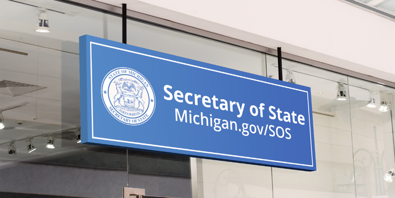
Dog Ear also created SOS signage designs along with MDOS's Word doc, PowerPoint and video intro templates.
Dog Ear helps businesses and organizations big and small get a handle on their branding. If you're interested in a new look or a refresh on a current style, reach out to us!